
This web application designed to fetch and display tweets related to natural disasters in real-time. The application provides users with up-to-date information by integrating data from Twitter feeds and help resource links The front-end is built using React, with a focus on creating a dynamic, user-friendly, and responsive interface.; Figma for Wireframing; Github for version control, team collaboration, and code management; Codepen for visual animation and design.
This project is a UTD Graduate project with member of 6. As a front-end developer, I was responsible for designing and implementing the user interface of the application. My primary focus was on creating a visually appealing, responsive, and user-friendly experience for the end-users. I also actively utilized Git for version control and GitHub for collaboration with other team members.
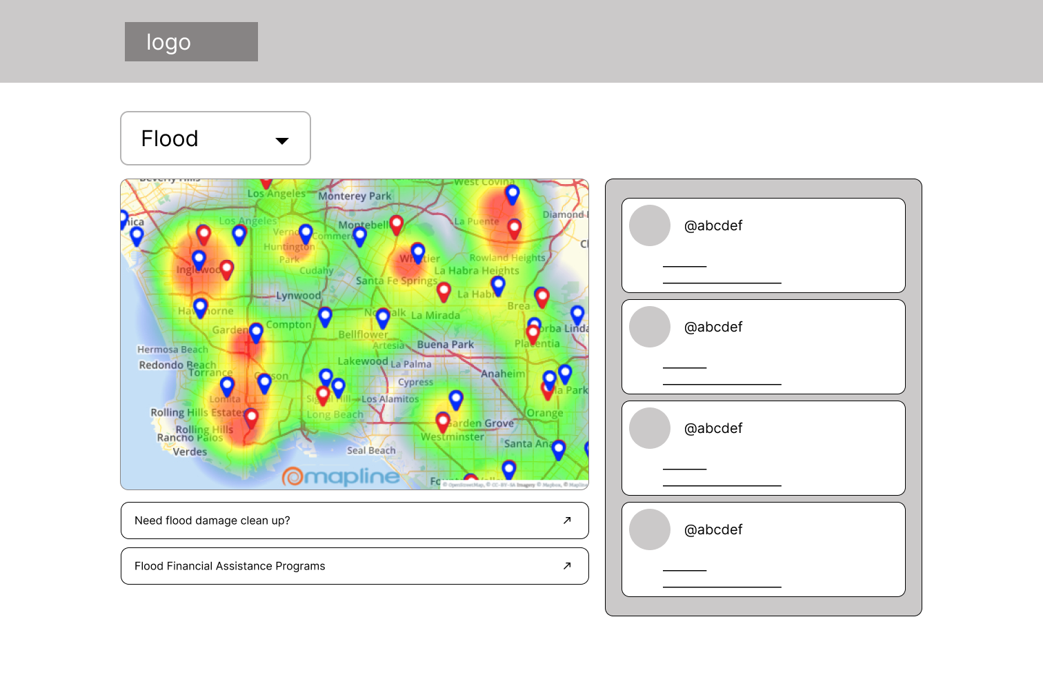
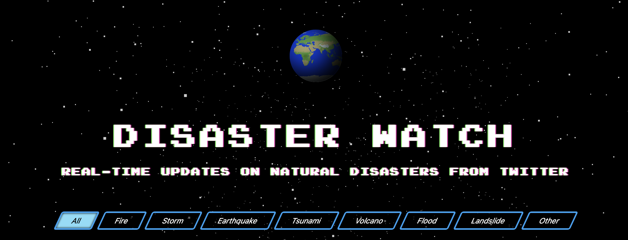
Rough Wireframe built with Figma and first HTML template
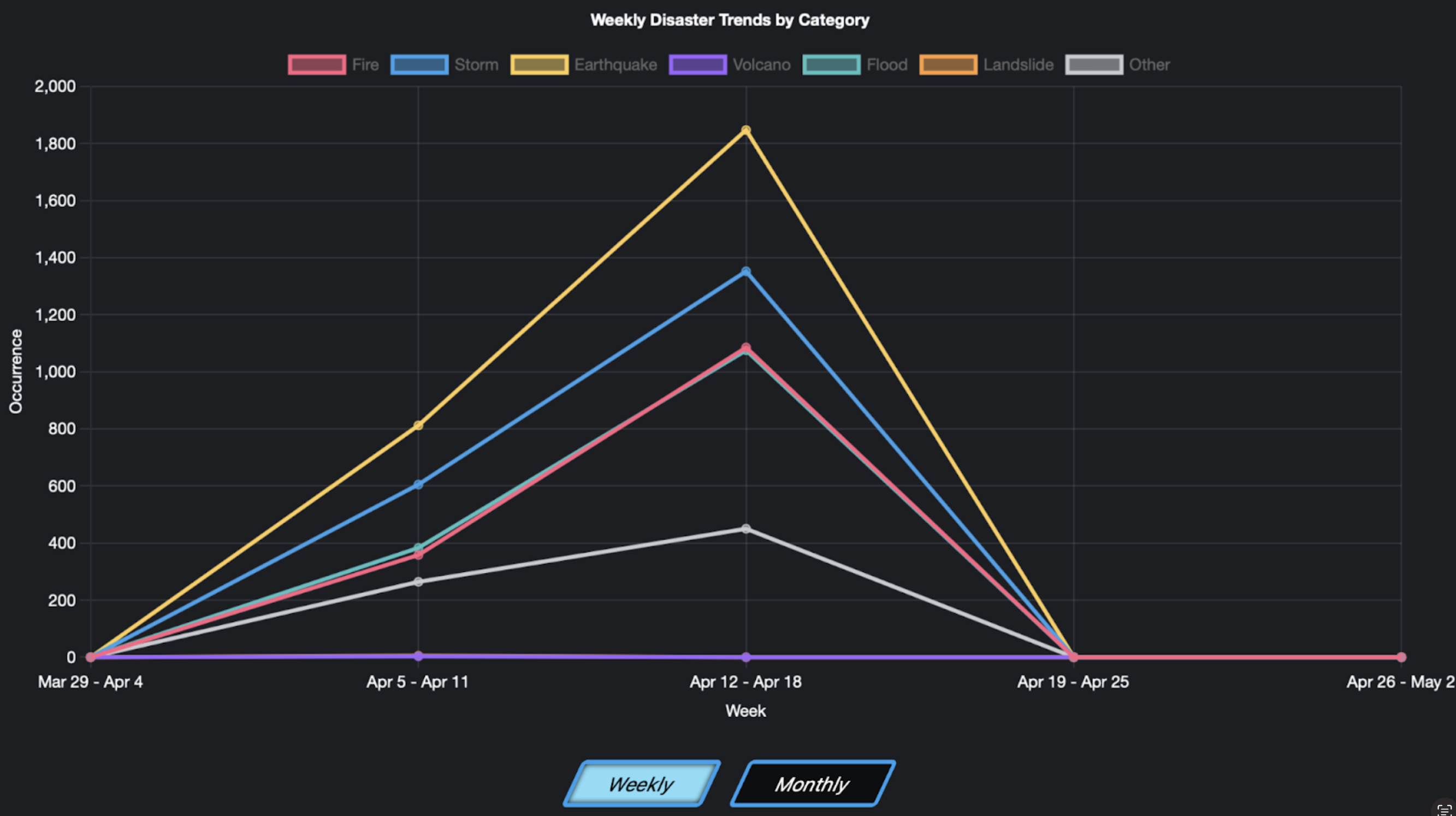
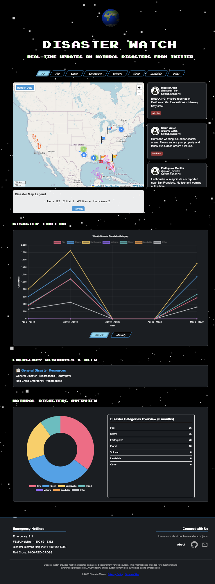
The Timechart is a visual representation of tweet activity over time, designed to help users track the frequency of tweets related to natural disasters both weekly and monthly. It features a timeline on the X-axis and the number of tweets on the Y-axis, dynamically updating as new tweets are fetched in real-time. This allows users to identify critical periods when discussions about disasters are most active, providing valuable insights into the intensity and progression of events.
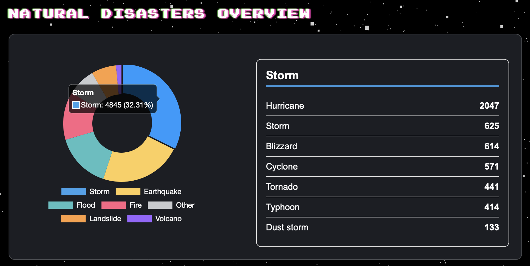
The Donut Chart provides a quick and intuitive overview of the distribution of tweets across various natural disaster categories, such as floods, earthquakes, hurricanes, and wildfires. Each segment of the chart represents a specific disaster type, with percentage values indicating the proportion of tweets for each category. This chart updates in real-time, enabling users to quickly understand which disaster types are receiving the most attention on social media.
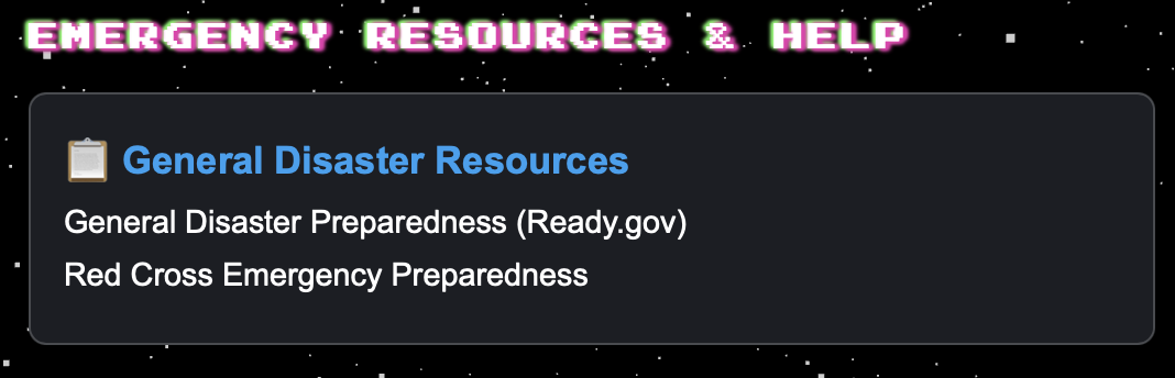
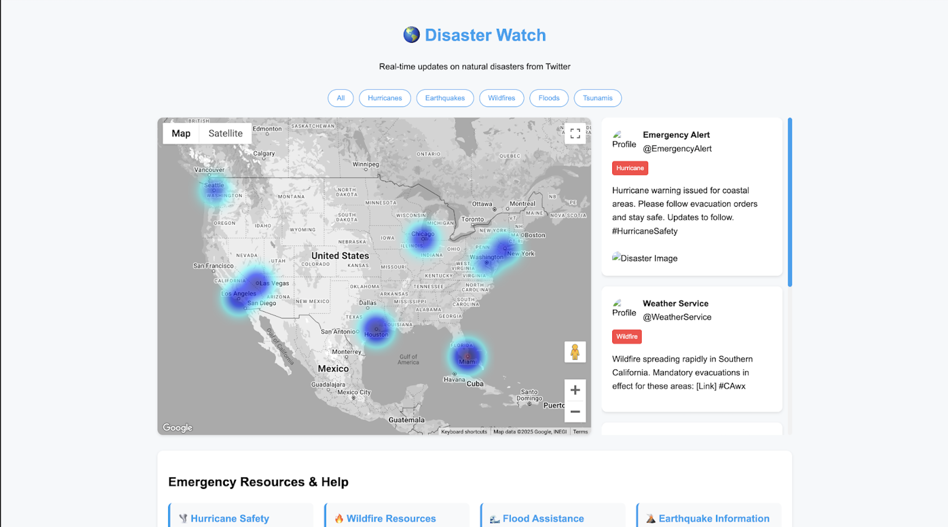
The help section of the website provides a comprehensive collection of emergency resources tailored to various types of natural disasters such as wildfires, storms, earthquakes, tsunamis, volcanoes, floods, and landslides. It includes curated links to trusted platforms like Ready.gov, Red Cross, NOAA, and USGS, offering safety tips, preparedness guides, and hazard information. Each resource is categorized based on disaster type to ensure users can quickly access relevant information in times of need. This section aims to empower individuals with the knowledge and tools necessary to stay safe and prepared during natural disaster events.
Final webpage design.
The project successfully delivered a functional and visually appealing web application that provides real-time updates on natural disasters. My contributions to the front-end ensured a seamless user experience, consistent design, and smooth integration with the back-end.
In conclusion, the webpage effectively combines real-time data visualization with interactive resource access to create a comprehensive platform for users during natural disasters. The dynamic interaction between the Help Section and Category Buttons ensures users can easily find tailored resources, enhancing the practicality and user-friendliness of the platform. By providing timely insights through the Timechart and Donut Chart, alongside actionable support via the Help Section, the webpage empowers users to make informed decisions and access necessary assistance swiftly. This project exemplifies the impactful use of technology in crisis situations, emphasizing the importance of providing both information and resources to navigate and respond to natural disasters effectively.
Check our github for detailed process and final presentation ppt!